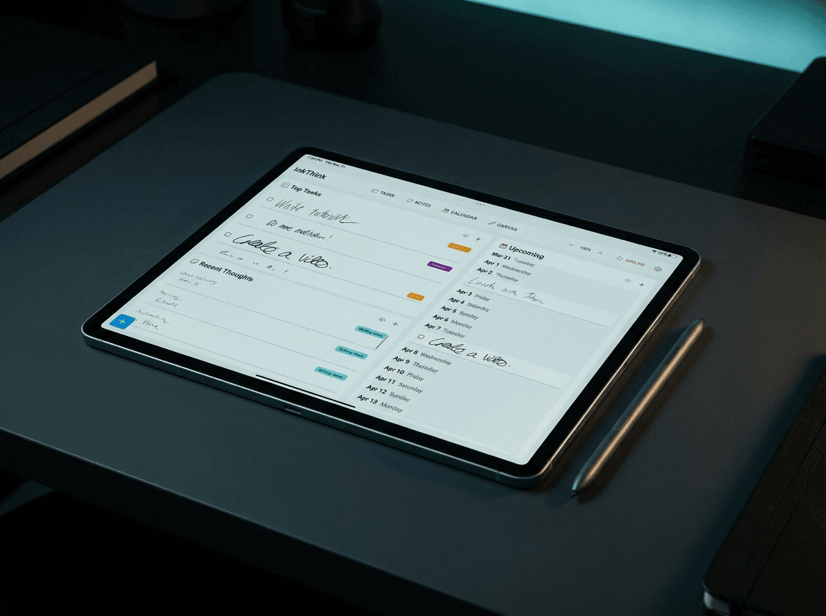
Find Your Planning Zoom — Then Pick a Planner That Actually Has It
Your brain has a native zoom setting for time. Most planners fight it. Here is the tactical test for matching your zoom to your planner before you buy another one that dies on the shelf.

Most planner advice starts with layout. Spread of boxes. Color of dots. Size of the monthly grid. That's the wrong layer. Before any of that matters, there's a more important question: how does your brain actually see time?
Your mind has a native zoom setting. Some people think in days. Some think in weeks. Some need the whole month in view before they can commit to anything. Most people hybrid two or three — what they really want is a planner that lets them switch.
Here's the test: when you plan, what's the smallest unit you need to see to feel oriented?
If you need today's hour-by-hour to feel in control, you're a day-planner.
If the week is the atomic unit you think in, you're a week-planner.
If you need the whole month in view before any decision feels possible, you're a month-planner.
Honest answer for most people: at least two of those, sometimes all three. And that's where paper planners fall apart. A paper planner has one zoom level per spread. To switch, you flip pages, lose context, and live with the friction. The hybrid stacks you see on power-planner desks — a paper month on top of a paper week on top of a paper day — are the zoom problem in disguise. Three purchases, three appointments to re-write, three places to lose your Tuesday dentist.
This is the problem stylus-first planners are supposed to solve. Most don't.
The Zoom Test (Tactical)
Before you pick another planner, write down what you did yesterday at three zoom levels:
Day view — what hour did you start, what did you actually finish.
Week view — which days were heavy, which were open.
Month view — what you committed to weeks ago and how it landed.
Whichever level felt most natural to fill in — that's your anchor zoom. That's the view you check first. The other two are scratch space.
The mistake everyone makes is buying a planner based on the layout they think they need, not the zoom their brain defaults to. That's why most planners die on the shelf by week three. The layout fights the zoom.
What Most Digital Planners Get Wrong
The standard approach is three separate tabs: Calendar, Week, Day. Some add a year. Each tab is a different document. You write the same appointment in two places — or you tolerate the fact that Tuesday's dentist shows up on the week view but doesn't count toward the monthly total.
Switching zoom shouldn't require rewriting. The same Tuesday dentist appointment should appear in every view your tablet can show — day, week, month, multi-month — without you retyping it. One write, every zoom. That's what intelligent ink looks like when the data model is built right.
Most apps can't do this. They ask you to choose where the appointment "lives." That's the wrong question.
The Zoom Stack That Actually Works
Here's the system tactical planners end up with, paper or digital:
Layer 1 — Month as map. Always-visible big picture. Birthdays, deadlines, travel, recurring commitments. This isn't for filling in tasks. It's for orientation. Am I in a heavy week or a clear week? Is the month already overcommitted?
Layer 2 — Week as planning unit. The one you actually fill in on Sunday night. Hours move from here. Monday 10am standup, Tuesday dentist, Wednesday deadline. Tasks blocked here get carried into the day.
Layer 3 — Day as execution. The day's actual shape. Today's three priorities. The meeting you don't want to forget. The day view exists to remove decisions during the day, not to plan during the week.
Layer 4 (optional) — Multi-month as horizon. For planners who think in quarters. Two-month and three-month views sit in this layer. Goals, milestones, habit tracking across longer arcs. Not a daily reference — a once-a-week review surface.
The mistake is treating these as separate systems. They should be the same data, shown at different zoom levels.
Why Stylus-First Changes the Zoom Math
On paper, zoom switching means flipping pages and rewriting. Friction. On a tablet without stylus-aware software, zoom switching means tapping through tabs and re-entering data. Same friction, worse feel.
A stylus-first planner that's actually stylus-first should treat zoom as a property of how the data is shown, not how the data is stored. You write on the day view at 2pm Tuesday, you tap week, the entry reflows to the right column. You tap month, it lands in the right square. You tap three-month, that dentist reappears in the right cell of the 90-day grid. One write, every zoom.
This is the structural difference between a digital planner and a paper one faked as digital. Real digital means the data shape is independent of the view. Faked digital means you're carrying paper's layout into the screen and putting a stylus on top.
The reason most stylus planner apps don't fully solve this: they were built from a drawing surface up, not from a calendar data model up. The drawing is the data. Switching zoom breaks the drawing.
Questions to Ask Any Planner Before You Buy
If I write an entry on the day view, does it appear in the week and month views without retyping? If no, the views are documents, not zooms.
How many zoom levels do I actually get? Day, week, month is the minimum. If you think in quarters, two-month and three-month views matter.
Can I write in ink on every view? If the week view is a static rasterized image of the day view, it's a screenshot, not a zoom.
What's the anchor view — the one I open first? A good planner makes this obvious in under a second.
Does the planner store style alongside the data? If I circle Tuesday in red, does the red move with the entry when I switch views?
The Real Diagnostic
Forget features. Forget brand. Forget layout photos that look great on Instagram.
The only test that matters: after 30 days, do you open it without thinking about it?
If yes, your zoom setting matched the planner's native zoom. If no, the planner is fighting your brain.
Paper planners work great for the right zoom. Most people aren't lucky enough that their zoom matches a single 6×9 spread. Hybrid stacks — paper month plus paper week plus paper day, each one a separate purchase — are how serious paper planners solve this. They've been doing it for years.
The stylus-first promise is that all those views live in one place, one write, every zoom. When it works, it's the cheapest planning system you'll ever own — one purchase, no recurring subscription, every zoom level you actually use. When it doesn't work, you end up with three planners fighting each other.
Pick Your Anchor, Then Choose the Views
You don't need every possible view. You need your anchor (the zoom your brain defaults to) and the one zoom above and below it that you'd actually look at.
Day anchor → day + week + month. Optional: 3-month for horizon reviews.
Week anchor → week + month + 3-month or 2-month.
Month anchor → month + 2-month + 3-month. Optional: week for execution pull-through.
A planner that offers every possible view is overselling you on what you'll use. A planner that has only the three "standard" views might be underselling on what you actually need. The right answer is the smallest set that covers your anchor plus the next layer out.
That's the test. Everything else is layout.
If you want to test out different zoom levels, download InkThink and test out the different views!
— Prem, Creator of InkThink